


WEB: Polarity Management
As Creative Director for Polarity Management I spent three years developing the Polarity Management Assessment Process (PMAP) software platform.
Along the way I rebooted the PMA identity, website, and business collateral, and designed new software support documents, and sales materials.
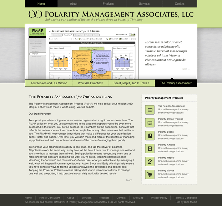
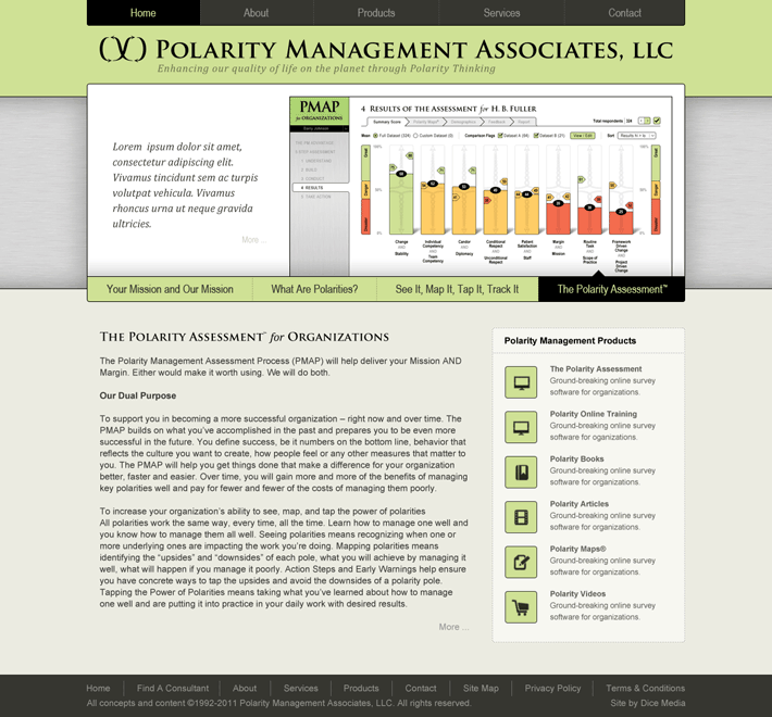
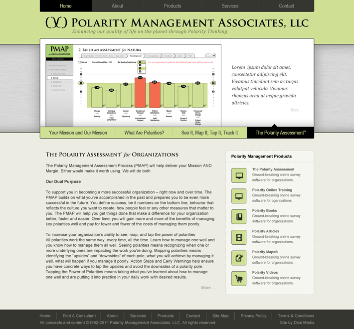
The website below proved a special challenge — showcasing the complex PMAP software UI within the website UI, while keeping both uncluttered and intuitive.

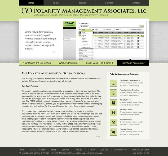
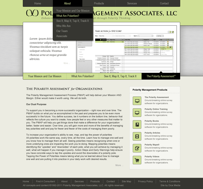

This site predates CSS3, HTML5, WordPress templates, and the Javascript plug-ins + widgets that are so pervasive today. The design grid and type were hand spec’d, the home page slider was manually assembled, and the UI and graphic elements were constructed of pixels. Old school.
I choose to take it as validation of my design that this site appears and functions as cleanly and simply as today’s better WP themes : )
Other related Polarity Management projects
UI + UX Map Brochure Book
Identity Arrow RTSC Coach
Education
See more projects that use these skills …